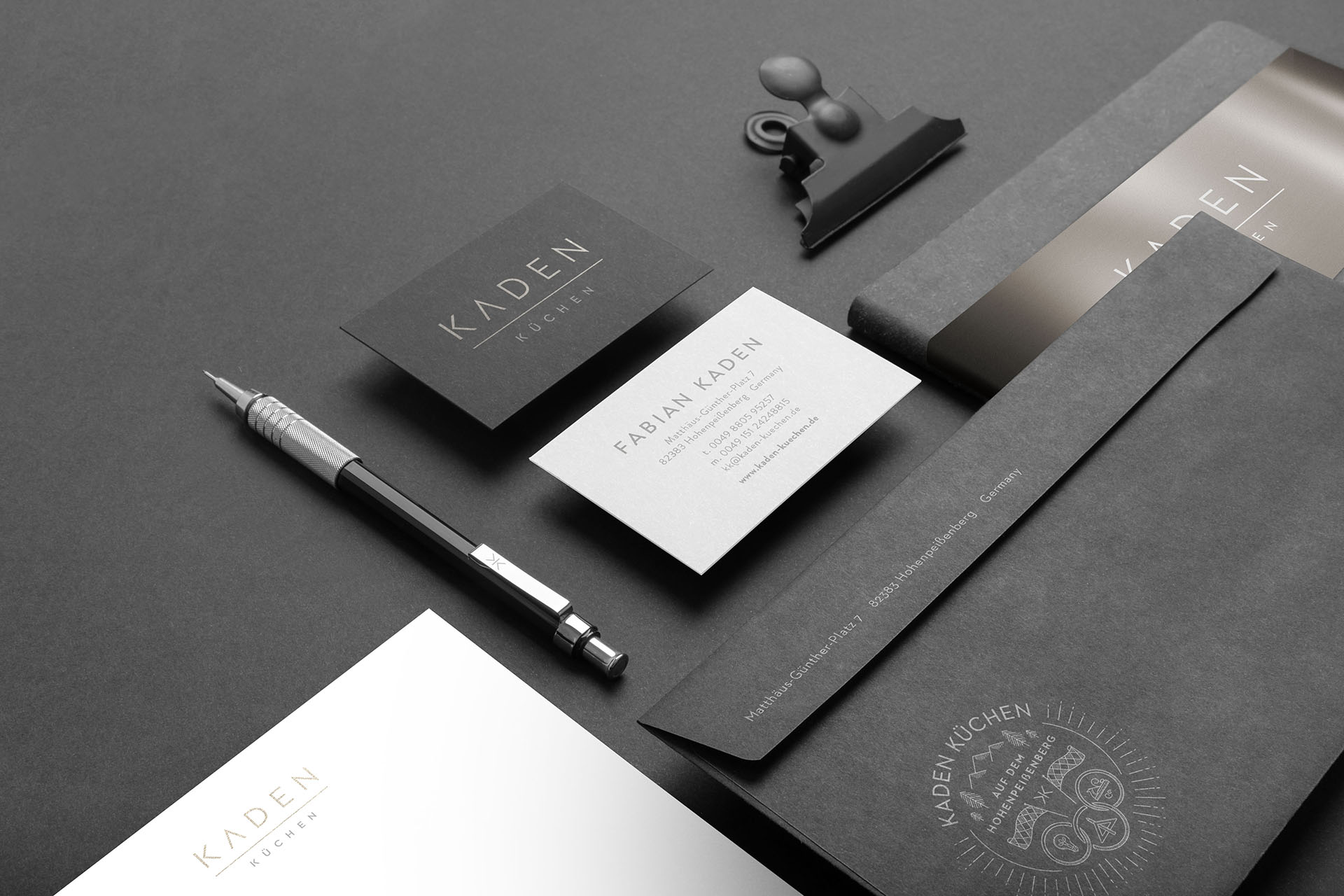
Kaden Küchen
Brand design for a kitchen interior studio in Bavaria/Germany
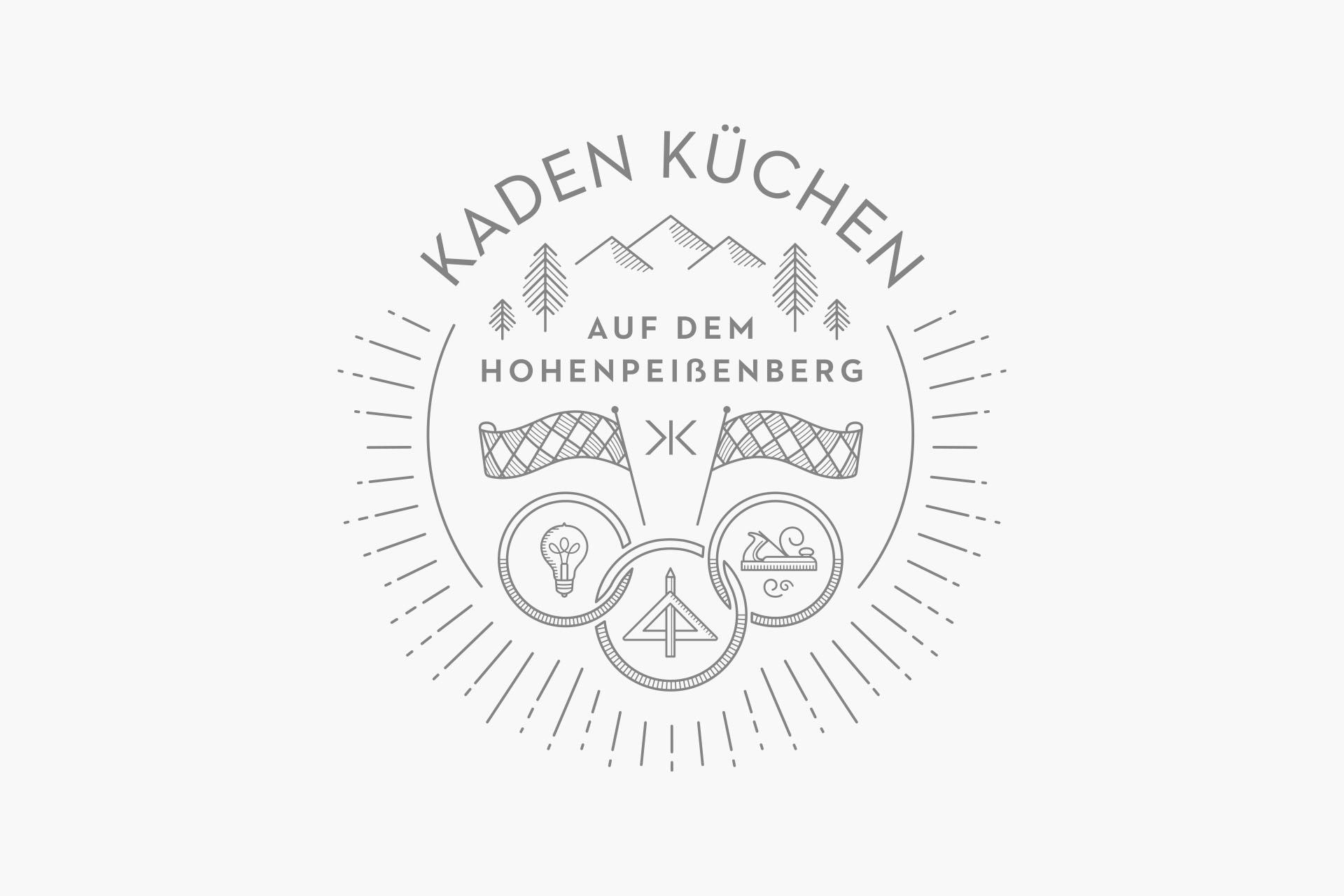
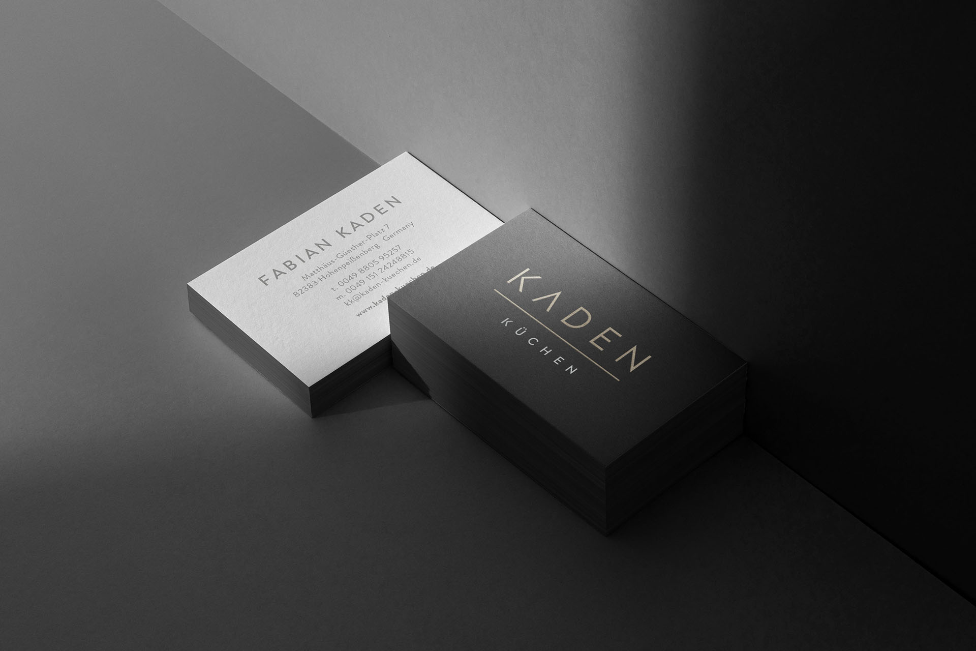
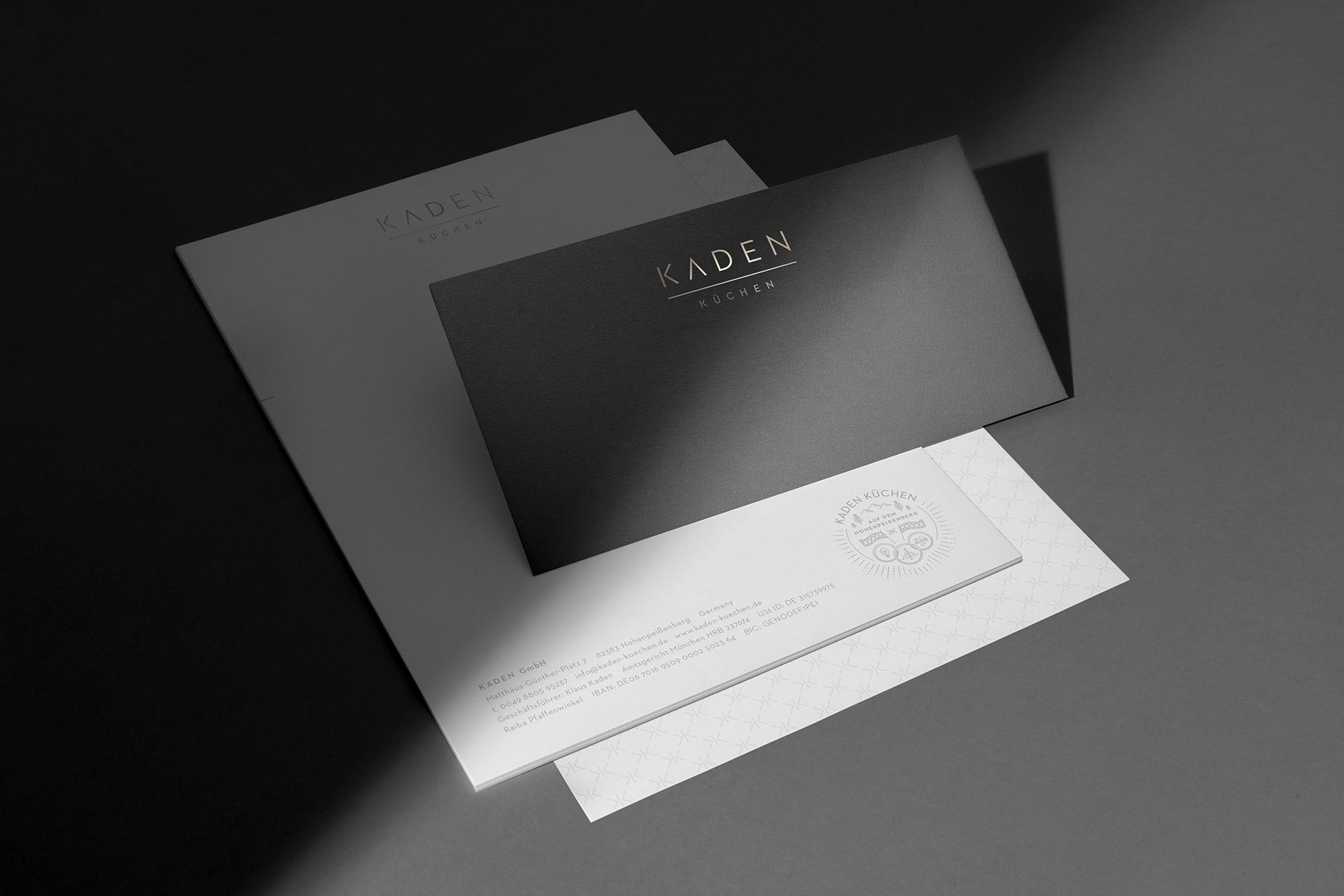
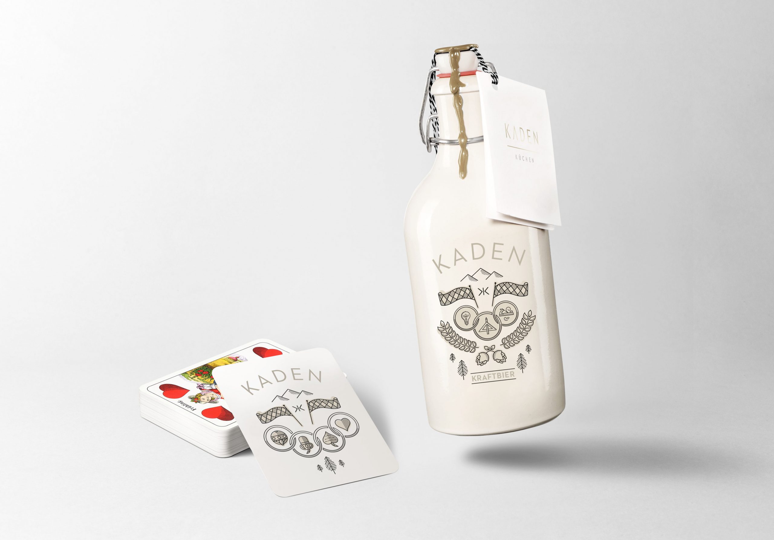
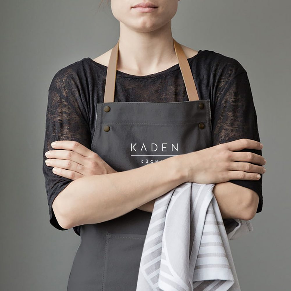
Creation of different corporate design elements like a signet for small applications as well as a pattern for larger areas. A graphic seal which symbolizes the different professions of “Kaden Küchen” as well as the Bavarian heritage has been created to contrast the minimalistic, reduced visual appearance of the other elements. This idea can be found through out the whole branding.
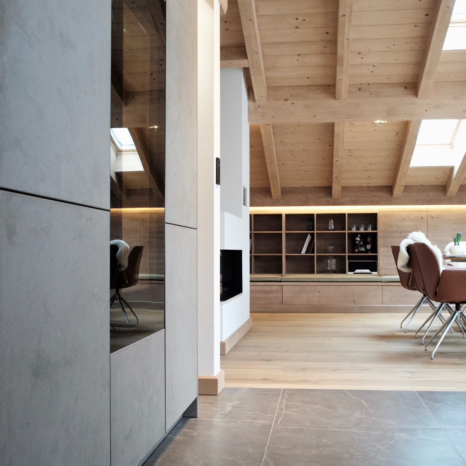
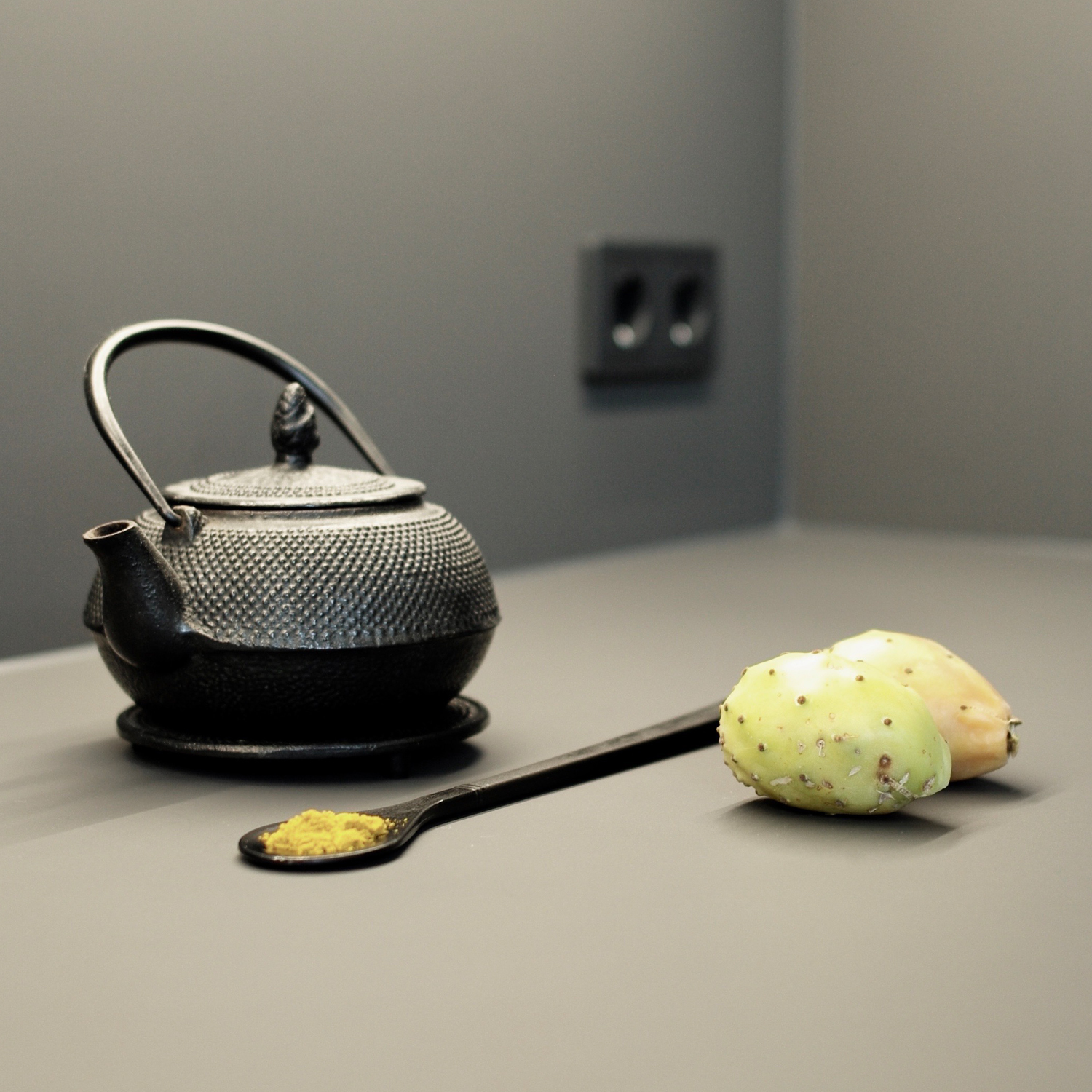
The visual language of the images represents the minimalistic and functional interior architectural style of “Kaden Küchen”. Desaturated, but warm colors dominate the photography.
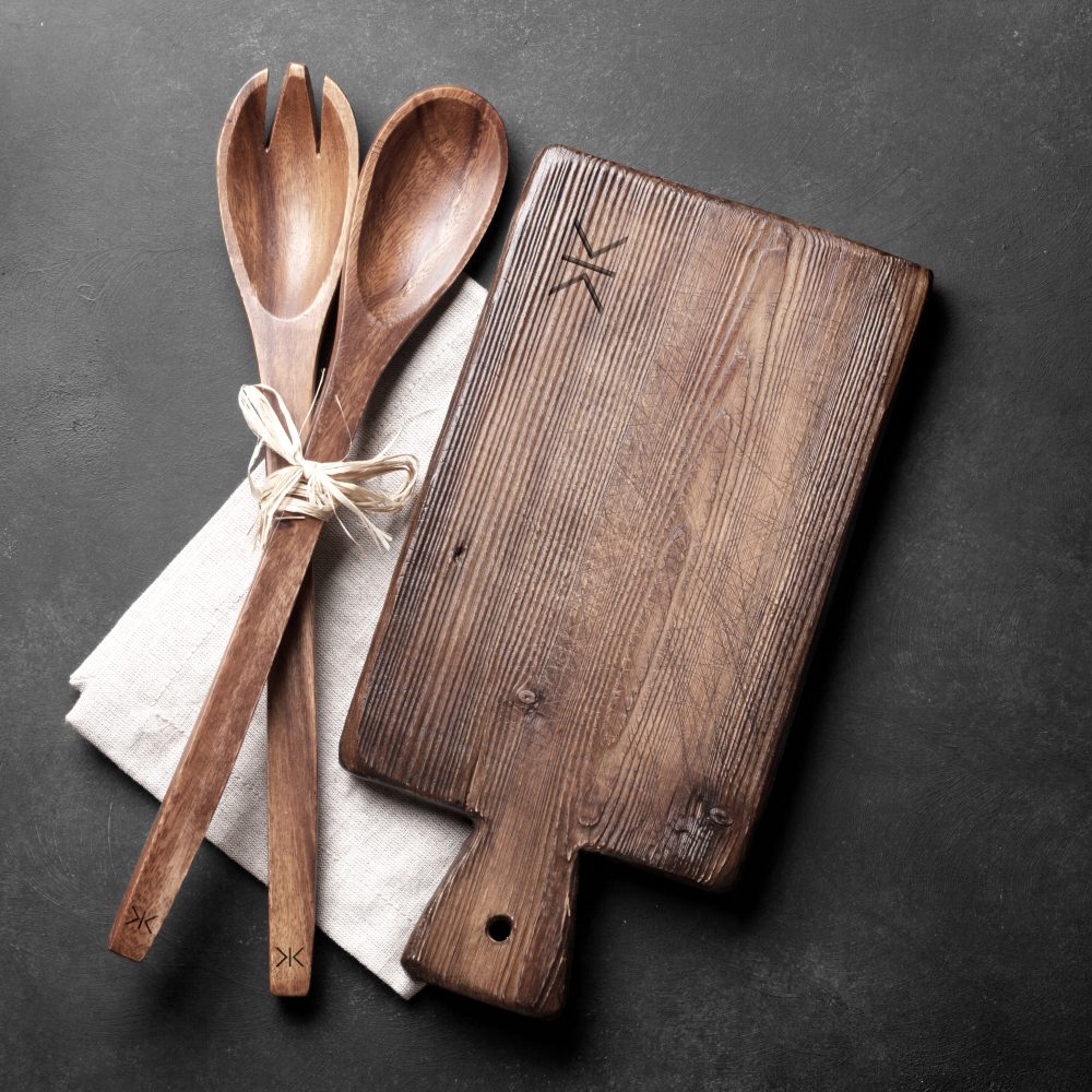
Giveaways with a hint of irony and a focus on high quality kitchen supplies as well as Bavarian heritage.


